Five Minute Upgrade – Making Your Design Pop
1. Brighten Colors
If you have a design that you just feel isn’t anything special – stop – crank up the color intensity – then reevaluate. Saturation plays a big role as far as mood goes. If you ever feel like you’re lacking inspiration when it comes to color schemes there are some great online tools, not to mention our own color series.
2. Use Monochromatic Themes Sparingly
Monochromatic themes are great, there are some great black and white designs and sometimes using only a single color makes designing easier. The point is to explore other colors as well without getting too hung up on one in particular. Branching out to more than one color palette means you can provide emphasis with something other than the lightness/darkness of a shade of blue.
3. Layout on a Grid
Here’s the deal, align your text and things will look better, not to mention it will increase your scannability. There should be some rhyme or reason to how you have placed your text, if there isn’t you risk a clumsy look which gives the impression that little thought went into it.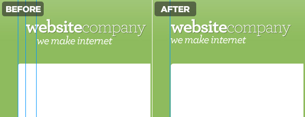
4. Take the Time to Polish
This was discussed wonderfully over at PsdTuts a while back but there are a few key things to keep in mind.- Don’t be afraid to use shadows sparingly, helps fight the flat and boring look.
- 1px lines are great at clearly defining edges.
- Using faint gradients over text and backgrounds gives a subtle 3D look.

5. Defy Image Boundaries
Overlap your images in ways that are out of the ordinary. Wrap around banners, pop-up images, anything that shakes the normal “color inside the lines” mentality websites are so often designed around. If you are fascinated as to how to go about doing this, check out Lee Munroe’s article on Designing Out Of The Box.
6. Add Whitespace
Give your user room to appreciate what you’ve done, it will help them focus on each element and not feel overwhelmed. Think of the padding as the frame for your work.
7. Textures
Adding noise to a background, including some rock pattern that fades into the backdrop, scribbles, whatever. Do something that makes your background a piece of artwork in its own right while complimenting the foreground.
8. Strokes
Don’t have them, use them. Strokes can be used in addition to the above effects to differentiate the foreground from the background. They can be a good substitute if you are trying to avoid gradients and maintain a more 2D look.
The Wrap Up
You’re now armed with a handful of tricks that can have an positive effect on your projects. Use your best judgment, not all of these adjustments are appropriate for every project. If you’re interested in a good example of all these steps put into play, check out Marketcircle’s website.Content Source : http://buildinternet.com


0 Response to "Five Minute Upgrade – Making Your Design Pop"
Post a Comment